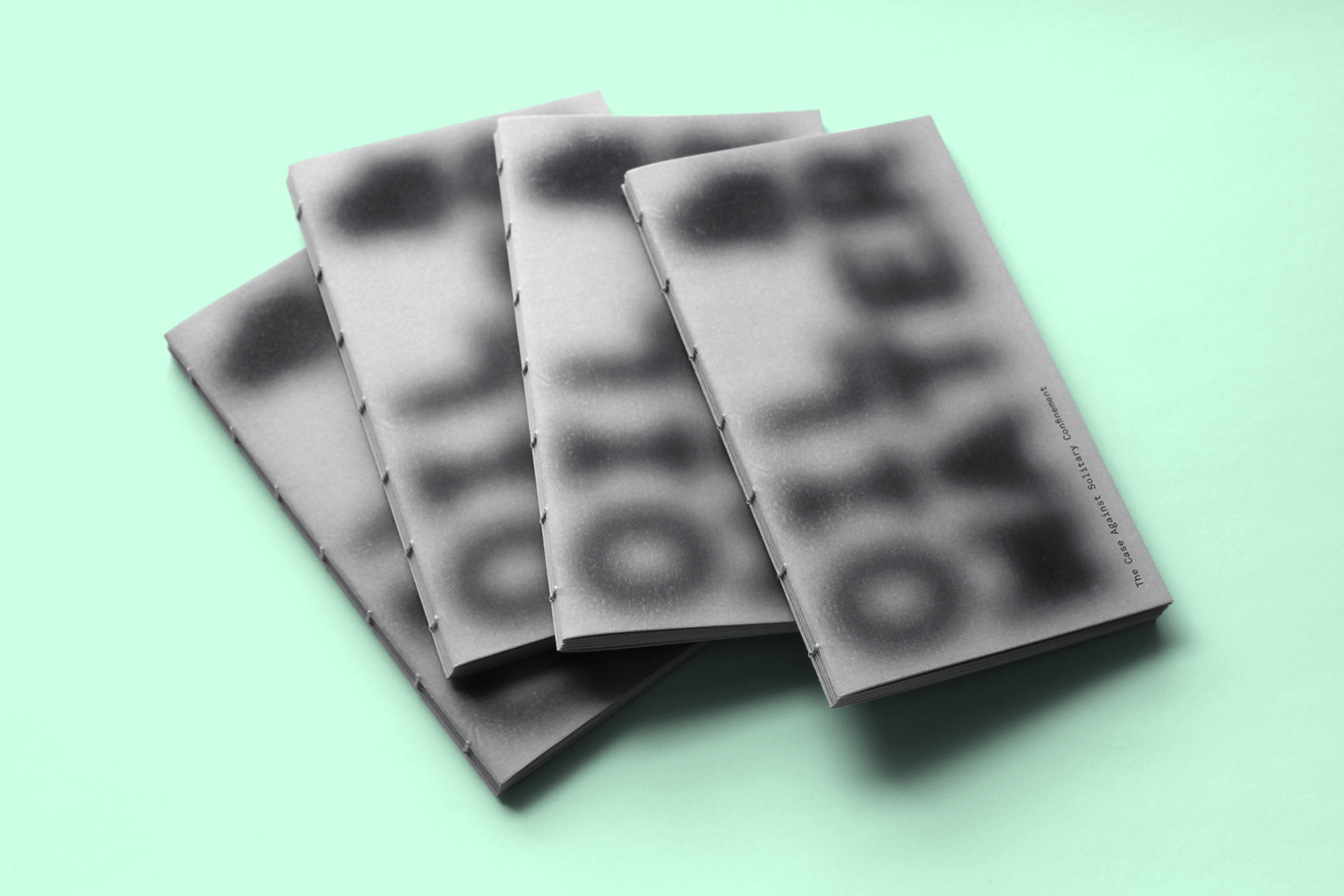
Oil & Water: The Case Against Solitary Confinement
COURSE
Advanced Graphic Design: Series and Systems
Yale University, Fall 2020
ASSIGNMENT
Design a chapbook around three thematically linked articles.
PROJECT
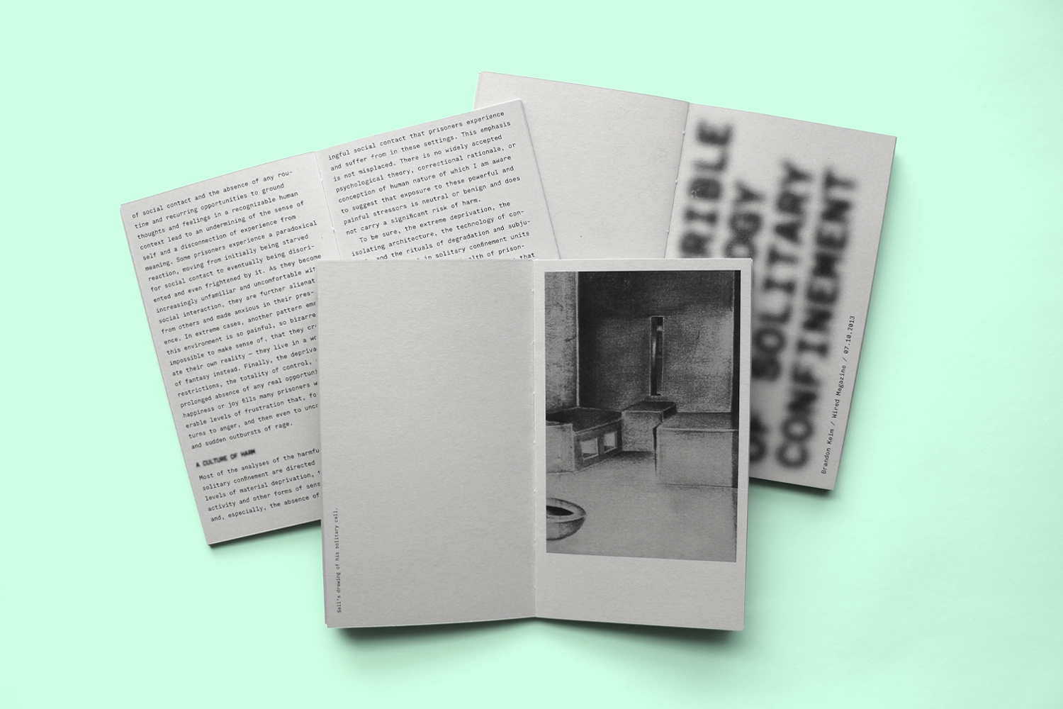
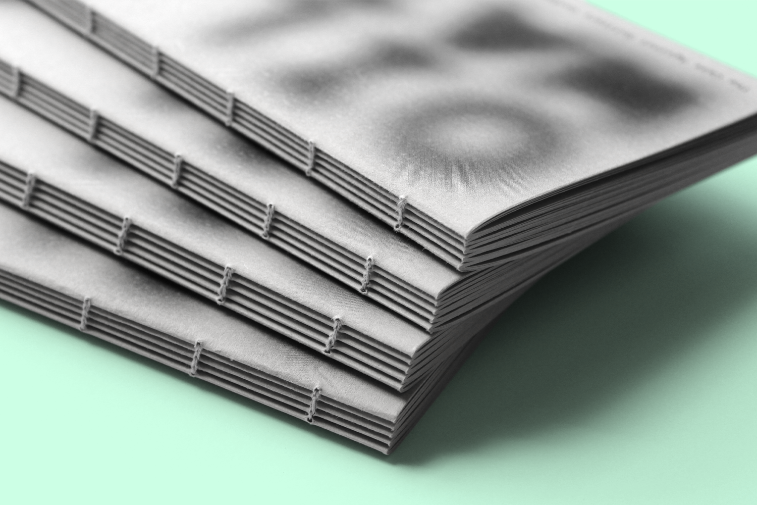
I designed a chapbook around the psychological effects of solitary confinement. The title, “Oil & Water,” refers to the inability of some prisoners to reintegrate into society after prolonged isolation. Set in a monoscript typeface, every character in the chapbook is lined up and confined to its own “cell,” an expression of incarcerated rigidity. Blurry titles are a visualization of mental deterioration. Thin page margins constrain the body text to create a sense of claustrophobia while blank spreads symbolize how emptiness and expansion of time in prolonged isolation. Coarse grey cardstock alludes to the stone and steel of prison, and the exposed binding is reminiscent of metal bars.


